The Art of the Ad
Click here to read the complete article212 – July/Aug, 2016
BY KRISTIN SPINNING
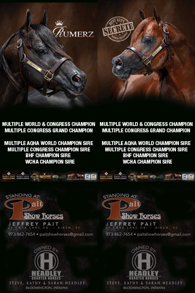
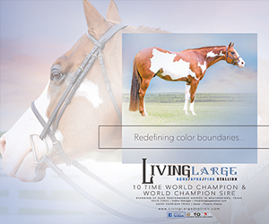
Advertising of elite horses and riders has evolved over the years to a level of unparalleled creativity.
When we’re being bombarded with media at every turn and it takes a great deal of craft and artistry to capture the viewer’s attention. This desire to stand out has propelled designers to use their artistic skills and unleash their imagination. A few prominent equine ad designers agreed to share their secrets to getting noticed. While all these designers agree on the clean design principle of “less is more,” there are interesting differences of opinion regarding the elements used to arrive at the final product.
Gail Bates
 Gail Bates has designed her way through the evolution of equine marketing and has managed to stay fresh in a changing environment. She reflects, “It’s easy for any designer to get into a rut with themes, fonts, and images.” To stay inspired and innovative, Bates gathers ideas for textures and backgrounds from many sources and makes adjustments until they work with her overall concept. “I tend to look through all the glamour magazines, catalogs… really everywhere to find something different.”
She’s witnessed many trends come and go. “There was a point, years ago, when advertising became very artistic,” she says. “Then, when the economy went down, I found people wanted to put way too much in their ads. It’s as if they felt they could afford this one ad, and they had to get everything in it.” Unfortunately, what followed was several years of too many win pictures and too much text. “Now, I think we have gotten back to the artistry.”
She enjoys telling a story with imagery. “I did an ad once for High Point that was a foldout. The first page consisted of puzzle pieces lying around. Then, as you folded out, the puzzle pieces went together.” All of the pieces fitting together was a great visual metaphor that grabbed attention.
Click here to read the complete article212 – July/Aug, 2016
